Space-Themed Micro-Interactions


The Problem
Most portfolios read the same way, a grid of projects and a bio. I wanted mine to actually feel like something, so that a recruiter or hiring manager understands who I am and what I'm capable of within seconds of landing on the site, not just after reading through case studies.
The Challenge
Three things had to hold true at once, and none of them could come at the cost of the others:
A visual identity distinctive enough to be memorable, without sacrificing usability
Readability across a genuinely visual, illustration-heavy interface
Navigation simple enough to stay effortless, even while the experience itself felt engaging
UX Thinking
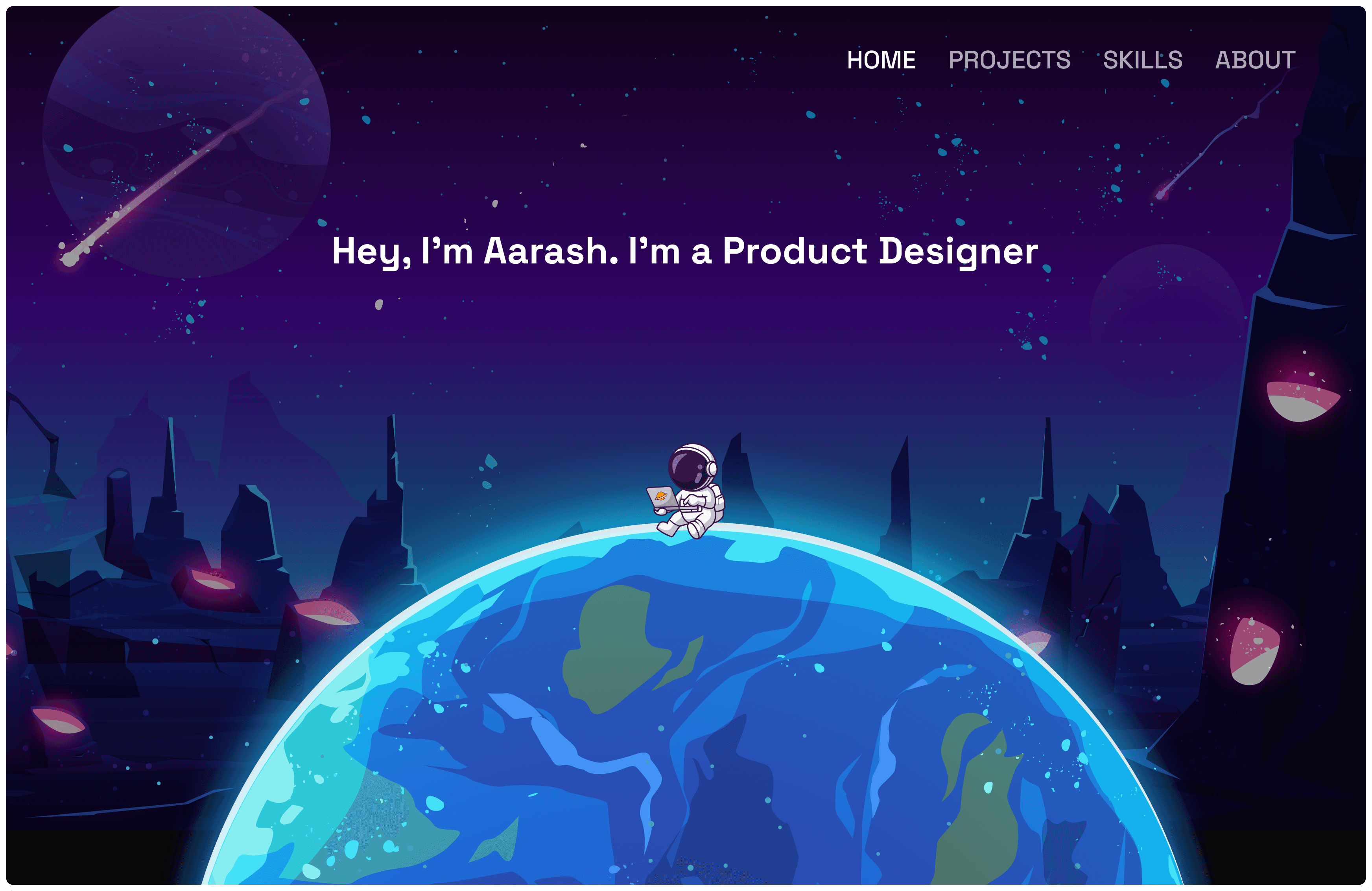
I structured the site around four core sections, Home, Projects, Skills, and About, so a visitor could understand who I am, what I do, and my experience with minimal effort. The structure stayed deliberately simple even as the visual layer got more ambitious, since the two needed to work independently of each other. No amount of visual polish should cost someone their ability to find what they came for.
Final UI
I designed a space-themed interface built around immersive illustrations, strong visual hierarchy, and glassmorphism-inspired content cards. The direction was chosen specifically to create a sense of exploration, something that invites a visitor to keep scrolling rather than just scan and leave.
Interactions
I used Figma Prototype to structure the navigation and page flow, and Figma Motion to design the animation work, animated navigation states, floating elements. The goal wasn't animation for its own sake, it was making the site feel interactive and polished in a way that reinforces the craft the portfolio is trying to demonstrate in the first place.
Outcome
The result is a visually distinctive portfolio that shows both UX structure and UI craft at once, built to encourage visitors to actually explore rather than skim and move on.
Limitations
One honest limitation worth naming: Figma Prototype isn't built to handle this level of motion and interaction smoothly, so the live prototype has noticeable lag and delay in some of the animations compared to how they were actually designed. The intended feel is closer to what's described above than what the prototype currently delivers, and it's something I'd want to solve either with a more performant prototyping tool or by handing the motion work off to code for a real build.