Slate


Slate
Redesigning transfer credit evaluation for academic advisors
Role: Product Designer (solo) Tools: Figma, FigJam, Claude AI Type: Case study / design exercise
Figma File: https://www.figma.com/design/DUnLJGOWCn6hAl7XcT1JQb/EDMO-Assignment?node-id=43-417&t=tK3pwp60a2CIQmG0-4
Overview
Academic advisors reviewing AI generated transfer credit evaluations spend most of their time re-checking work the AI already got right. Slate is a redesign of that review workflow, built around one idea: an advisor's real job isn't reviewing every course, it's finding the handful that need a human decision, fast.
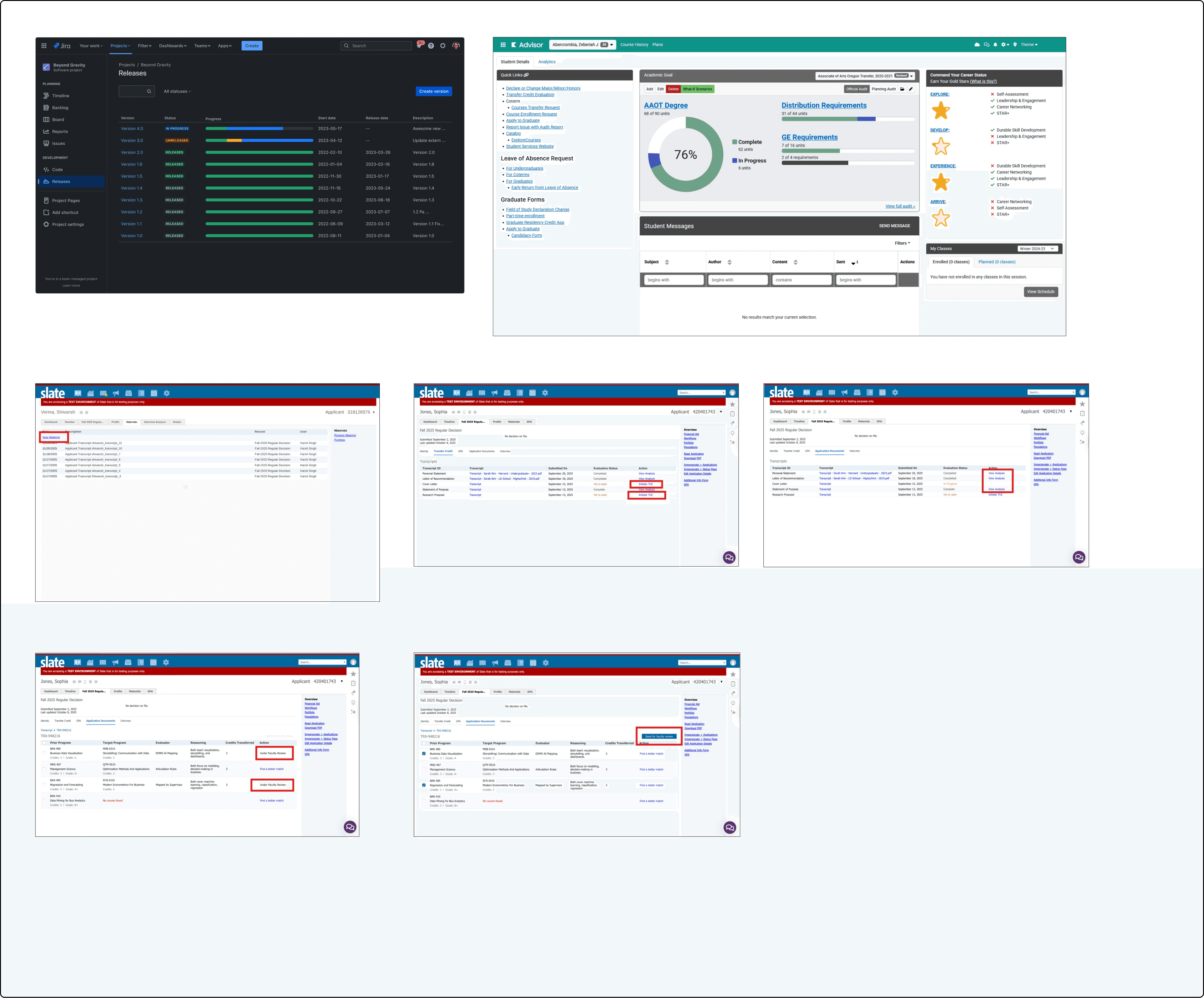
The problem
Advisors evaluate transfer credits in batches of 20-150 students a week. Each evaluation runs an AI match against the student's transcript, but the interface treats every course the same way, satisfied, needs review, and untouched requirements all sit at the same visual weight. The advisor has to read everything to find the few things that matter.
That creates two failure modes: advisors miss real exceptions buried in noise, or they re-verify everything by hand anyway because the system gives them no reason to trust it.
Research goal
Understand how advisors build trust in transfer credit decisions, what causes them to review or override a recommendation, and which signals immediately draw their attention to a case. This would help design trust indicators based on real advisor behavior rather than AI confidence scores alone.
A few questions I'd want answered with real advisors:
What's the smallest signal that makes you stop skimming and open a case?
What did a past wrong transfer credit call look like, and what would have caught it earlier?
How do you currently decide "trust this" vs. "check this" in your head?
Meet Maria
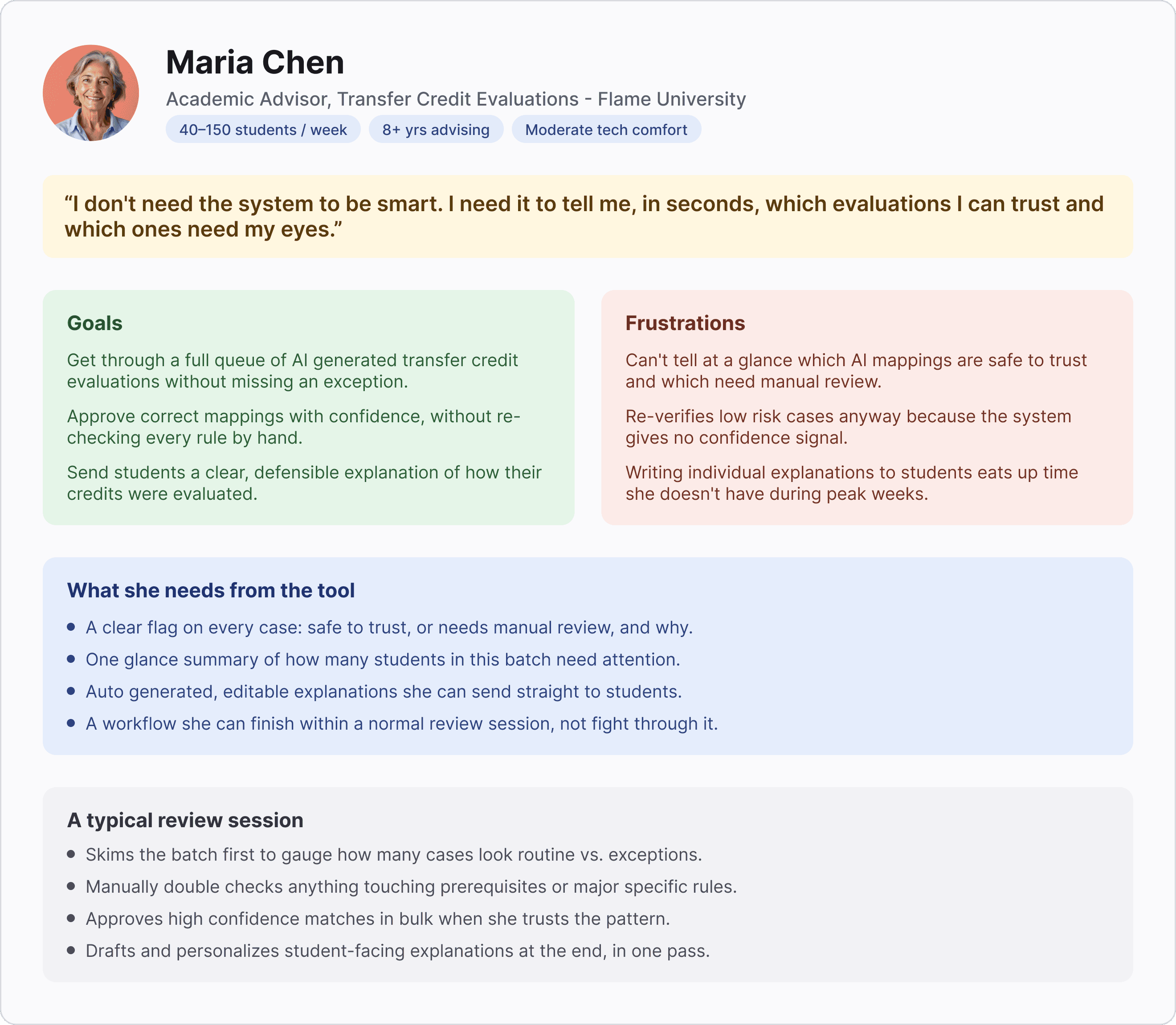
Maria Chen: Academic Advisor, Transfer Credit Evaluations, Flame University 40–150 students/week · 8+ years advising · Moderate tech comfort
"I don't need the system to be smart. I need it to tell me, in seconds, which evaluations I can trust and which ones need my eyes."
Goals
Get through a full queue without missing an exception
Approve correct mappings with confidence, without re-checking every rule by hand
Send students a clear, defensible explanation of how their credits were evaluated
Frustrations
Can't tell at a glance which AI mappings are safe to trust
Re-verifies low-risk cases anyway because the system gives no confidence signal
Writing individual student explanations eats up time she doesn't have during peak weeks
A typical review session: she skims the batch to gauge routine vs. exception, manually double-checks anything touching prerequisites, bulk-approves high confidence matches when she trusts the pattern, and drafts student explanations at the end in one pass.
Information architecture
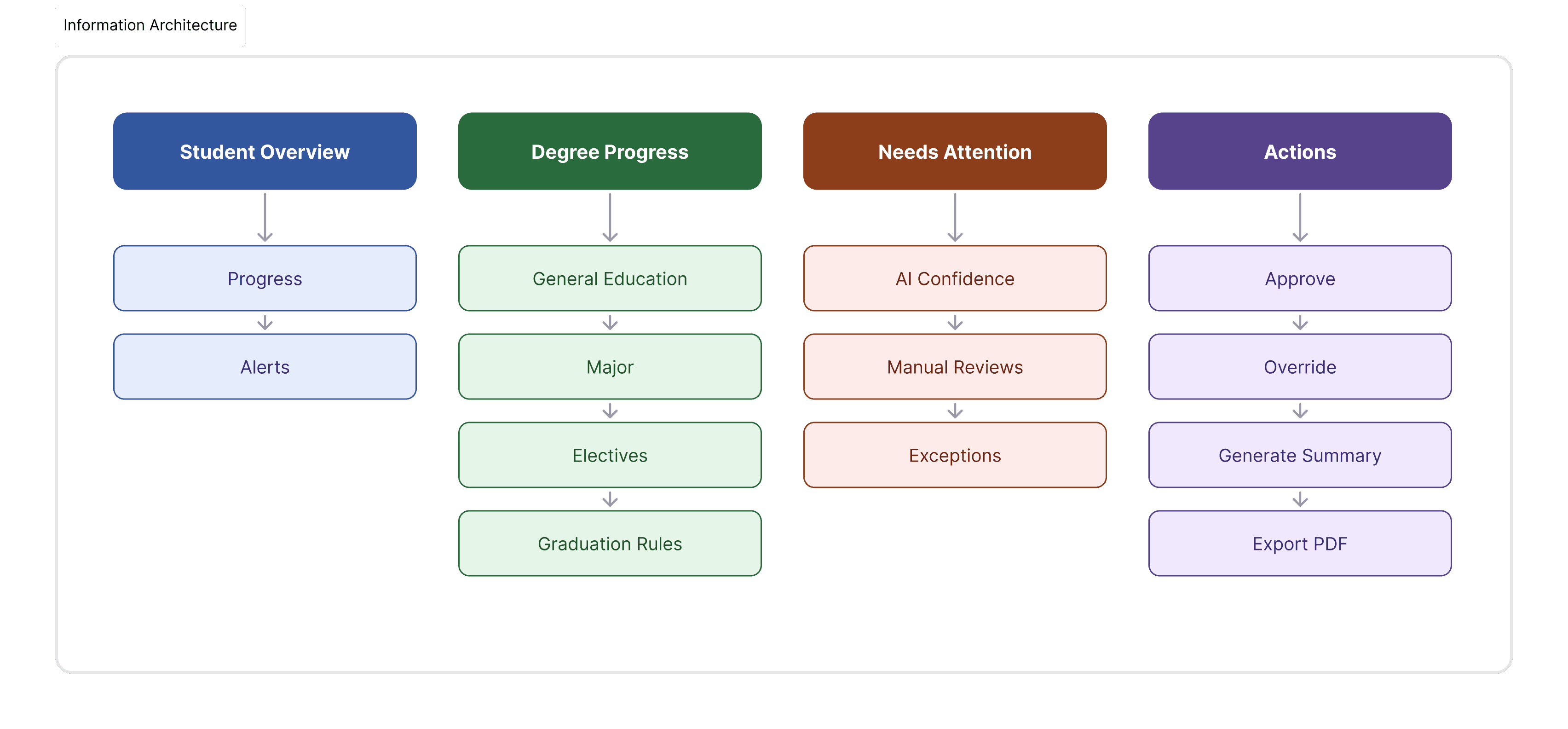
I structured the product around four branches that mirror how an advisor actually thinks about a student: Student Overview (progress, alerts), Degree Progress (Gen Ed, major, electives, graduation rules), Needs Attention (AI confidence, manual reviews, exceptions), and Actions (approve, override, generate summary, export). Every screen in the flow maps to one of these branches.
Wireframes
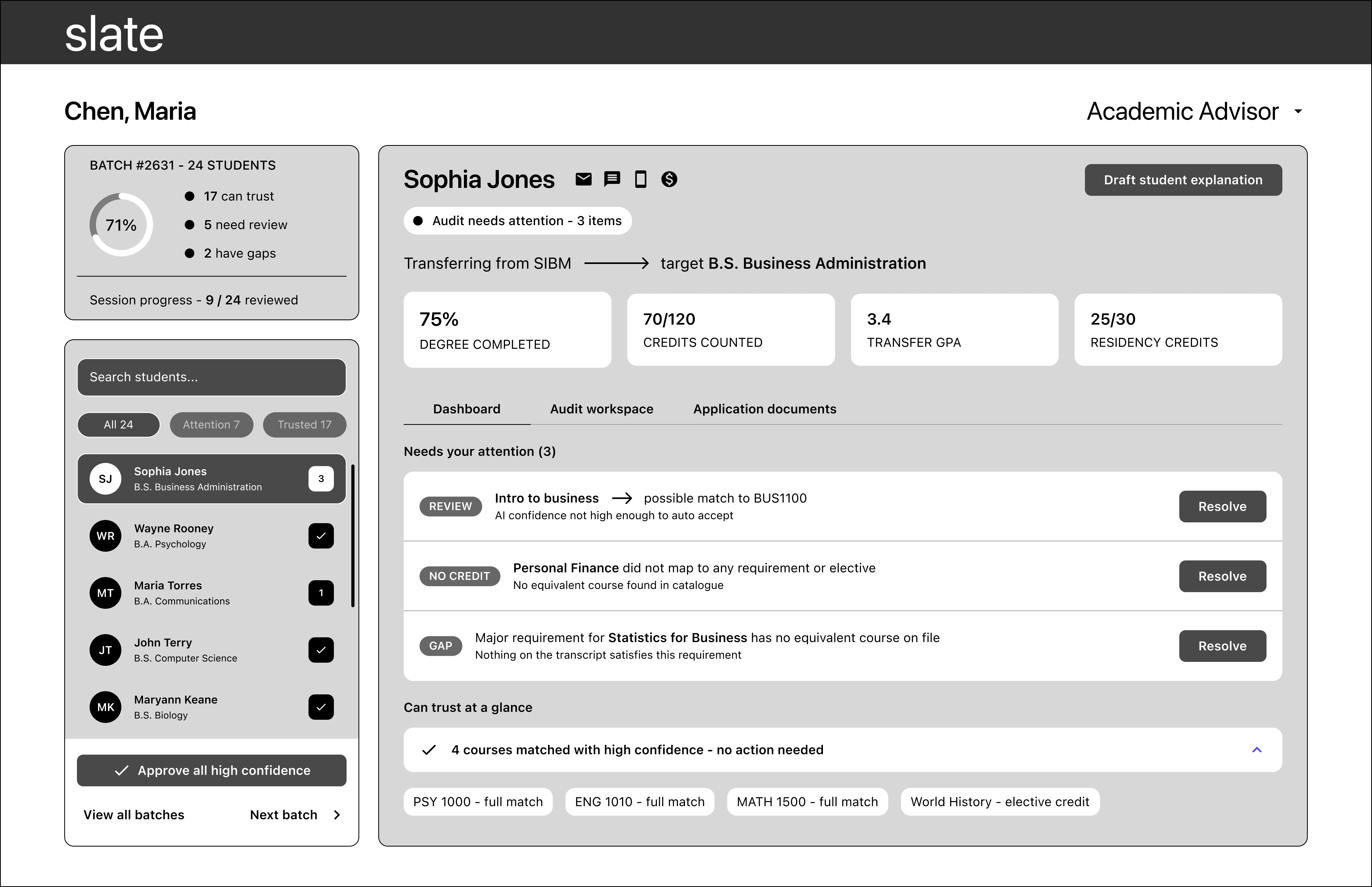
The core flow
Queue < student < resolve < send
1. Student queue
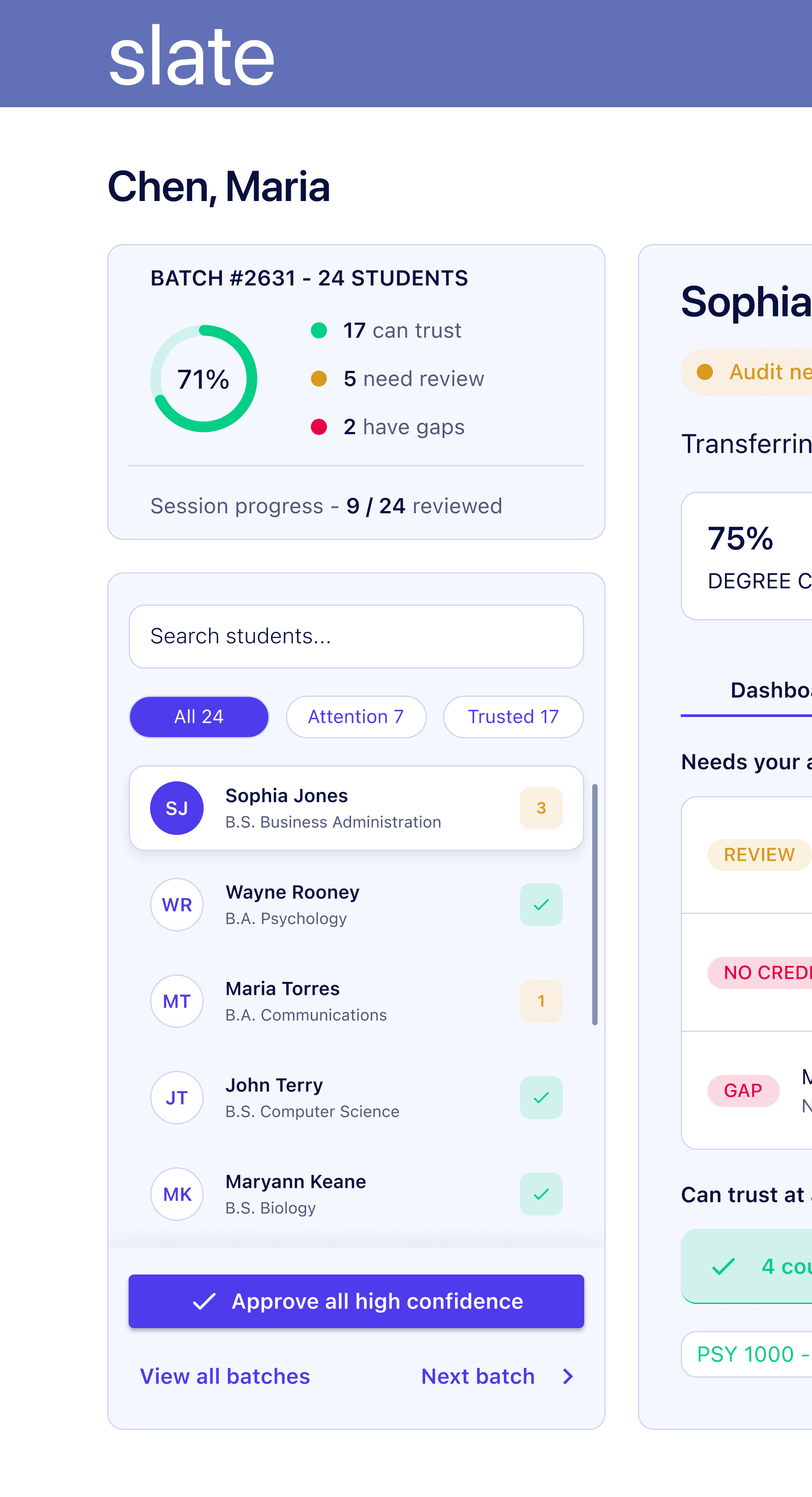
A searchable, filterable list of every student in a batch. Status badges, a number for pending items, a checkmark for cleared, tell the advisor what's waiting before they click in. "Approve all high confidence" sits at the bottom as a one-click bulk action for the routine cases.
2. Dashboard
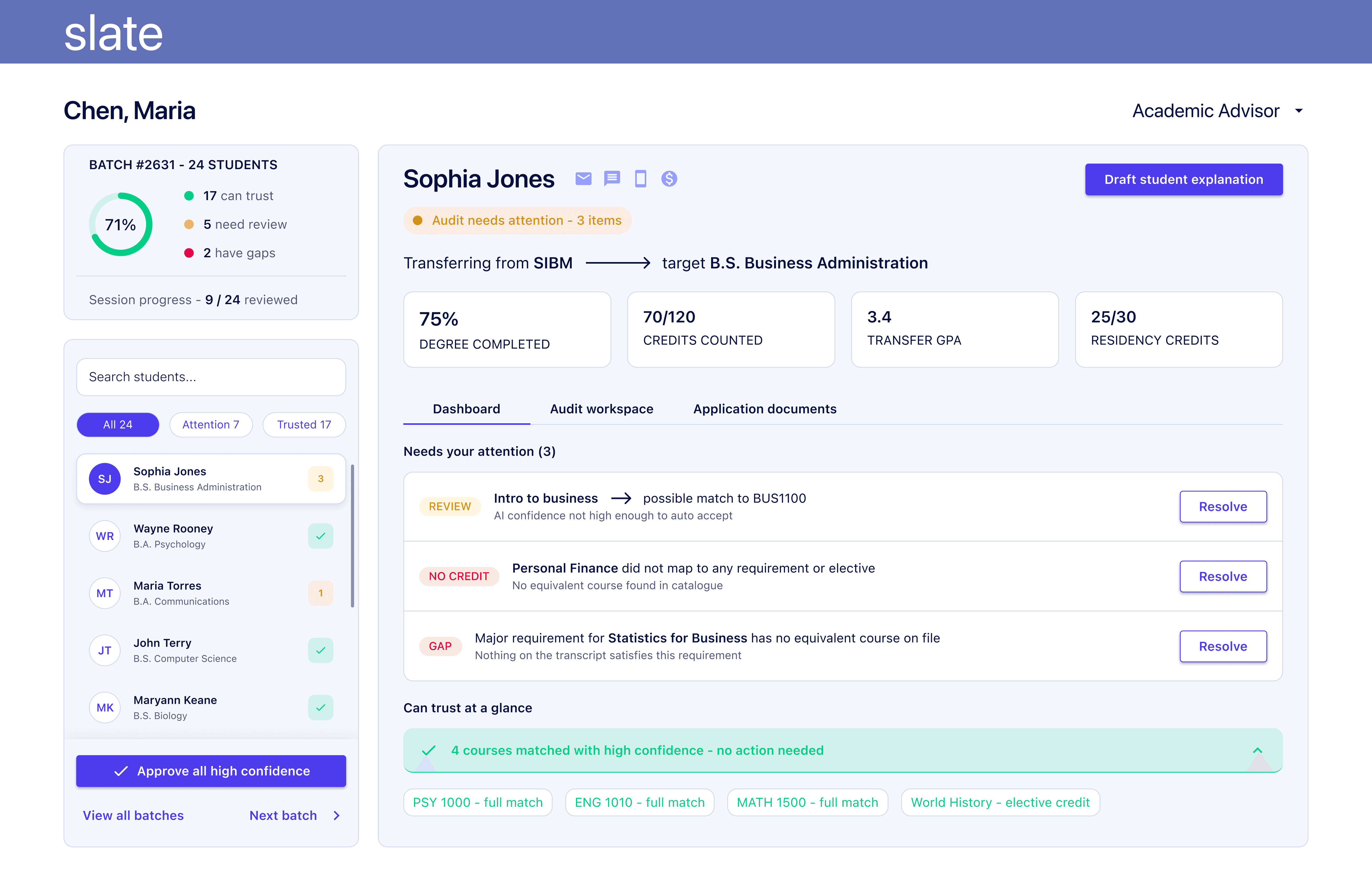
Opens on Needs your attention, not a full audit. Each flagged item shows its type, review, no credit, gap, with the reason attached, so the advisor doesn't need a second click to understand why something's flagged. Trusted matches collapse underneath, checkable but out of the way.
3. Audit workspace
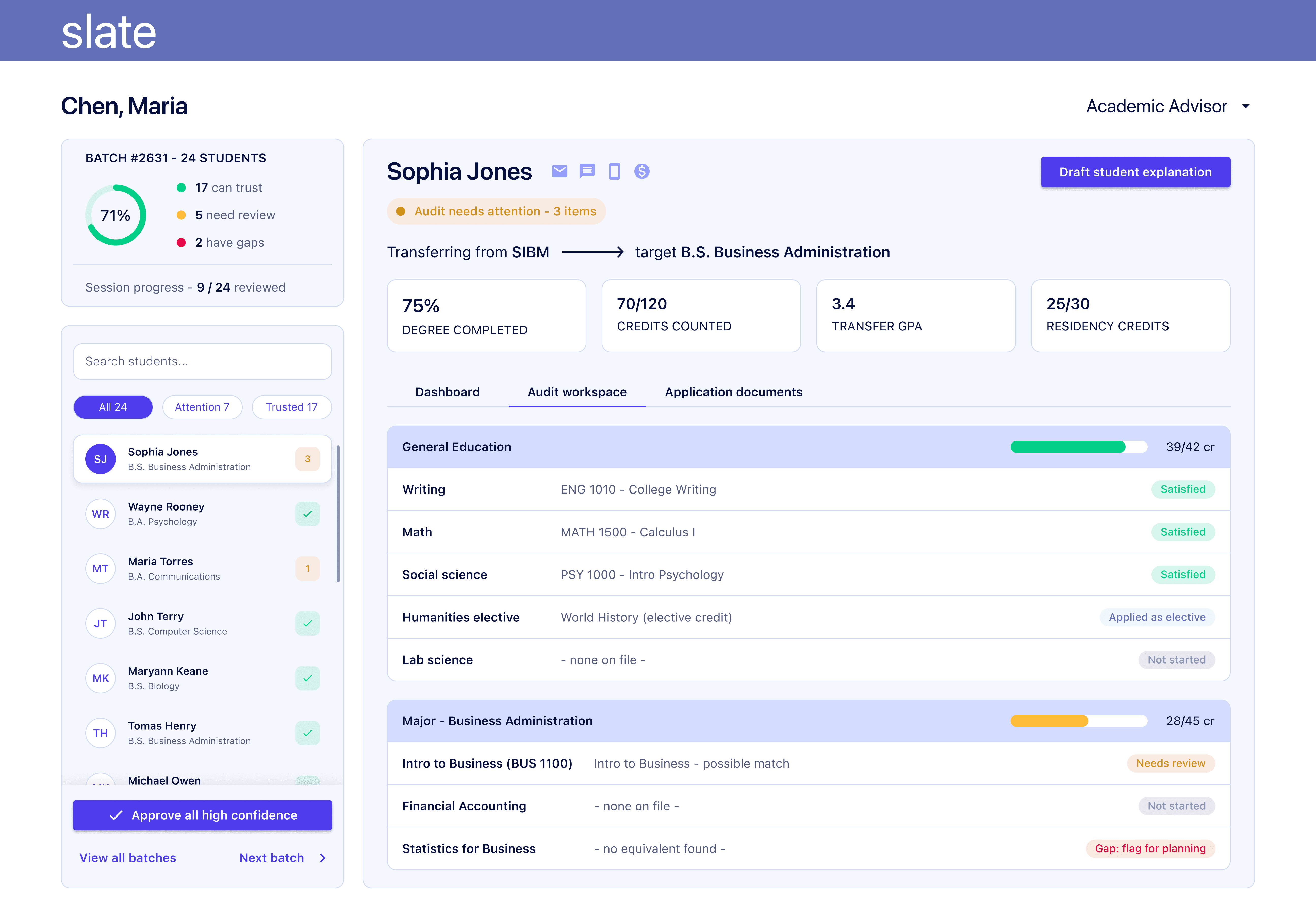
The full requirement ledger, General Education < Major < Electives < Graduation Rules, for when a summary isn't enough. Every row shows its source evidence (matched course, or "none on file") next to its status.
4. Resolve
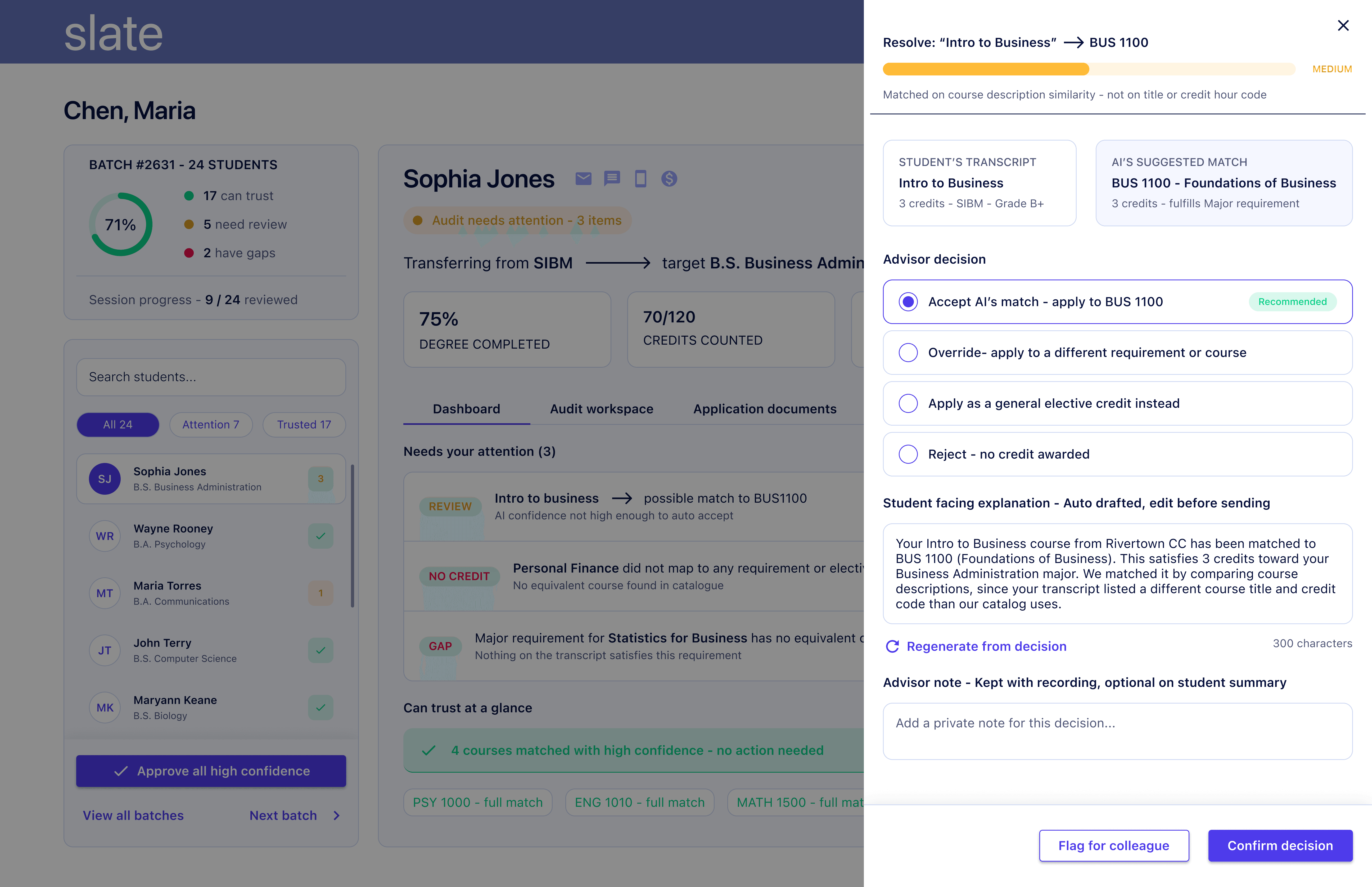
A focused decision screen for one flagged case. AI's reasoning and confidence sit above the decision. Transcript and suggested match are shown side by side. Four bounded decision paths, accept, override, apply as elective, reject, keep the outcome auditable. The student-facing explanation is auto drafted from whichever option the advisor picks, editable in place.
5. Submit to student
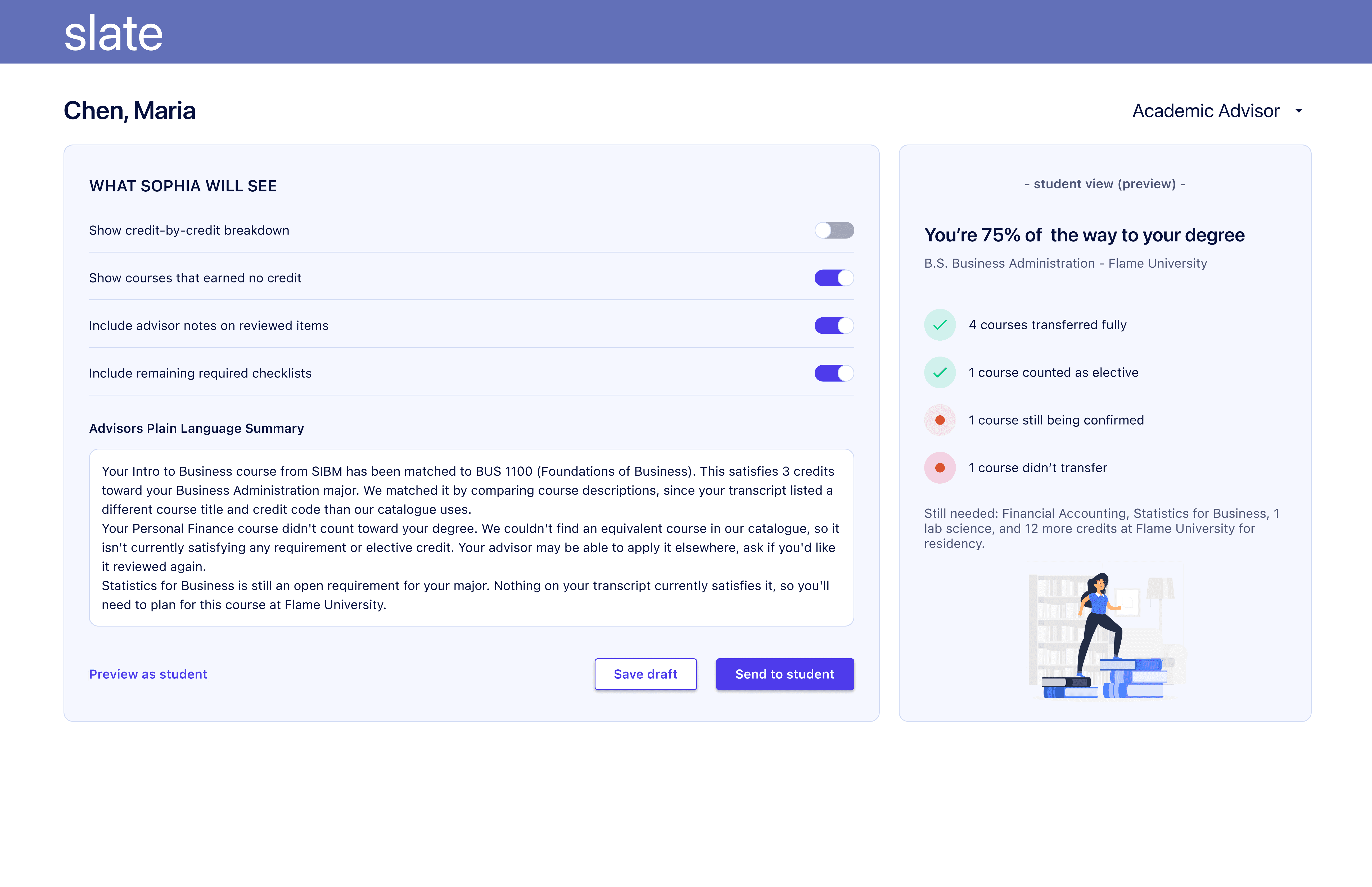
Visibility toggles next to a live student-view preview, so the advisor sees exactly what a toggle changes before sending anything. "Preview as student" and "Send to student" are deliberately separate actions.
6. Student preview

Exactly what the student receives, no confidence scores, no internal terms like "gap" or "medium confidence." Just what's accepted, what's pending, what's still needed, in plain language.
Key decisions and trade-offs
Splitting Dashboard from Audit workspace: The default view shows three flagged items instead of a full requirement list. This costs a tab switch when an advisor wants the complete picture, but it means the everyday review never starts with scanning past twenty satisfied requirements to find the one that matters.
Bulk "approve all high confidence": This trades some risk, the possibility of rubber-stamping, for real time savings on a 24-student batch. I kept the full list visible underneath rather than hiding what got auto-approved, so the trade is speed with a visible undo path, not speed with a black box.
Auto drafting the student explanation from the advisor's decision: Saves a step by writing the explanation in the same motion as the decision, but it also means the explanation exists before the advisor has necessarily stress-tested the call. "Regenerate from decision" is the safety net, but it relies on the advisor remembering to use it.
Stripping all AI language from the student view: A student doesn't need to know a match was uncertain, only what's confirmed, pending, or missing. This keeps the page simple, but it also means a student who asks a sharp follow-up question gets no answer on the page itself, only from the advisor directly.
What I'd do next
Test the confidence thresholds with real advisors to make sure "Medium" and "High" are guesses right now, not calibrated to anything.
Observe how advisors use "Bulk Approve" to ensure it speeds up the process without encouraging approvals that aren't properly reviewed.
Add an audit trail so every AI recommendation and advisor override is recorded, making decisions easy to review later.
Measure the time taken to complete a batch before and after introducing AI features to confirm they deliver real efficiency gains.
Validate the red, amber, and green status indicators with color-blind users, and add icons or labels so information isn't communicated by color alone.