Jules AI (Company landing page)
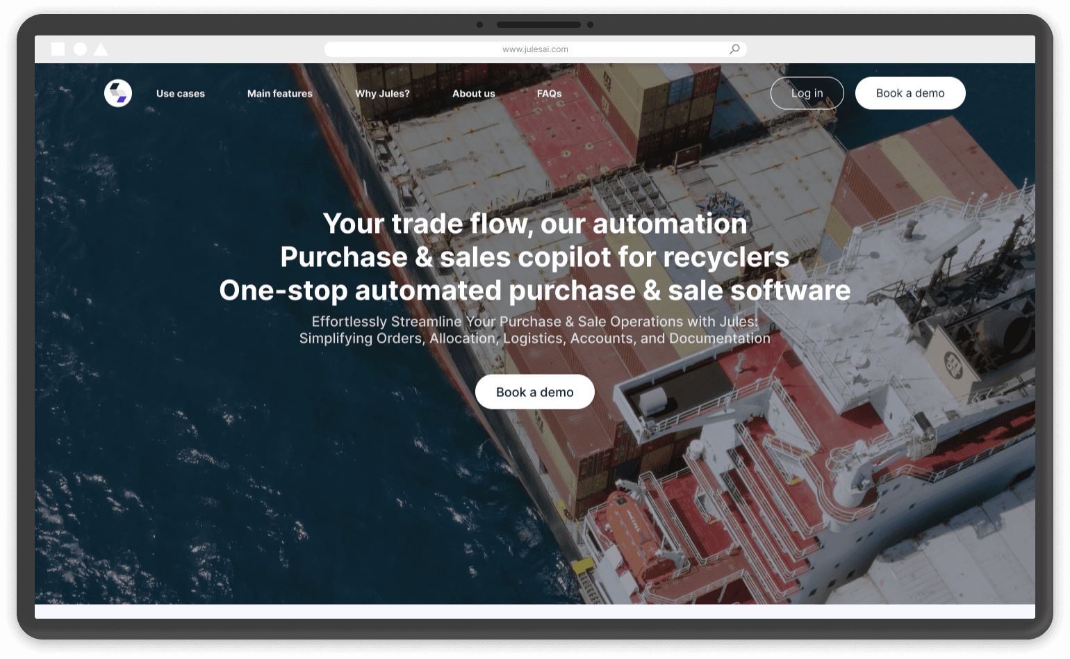
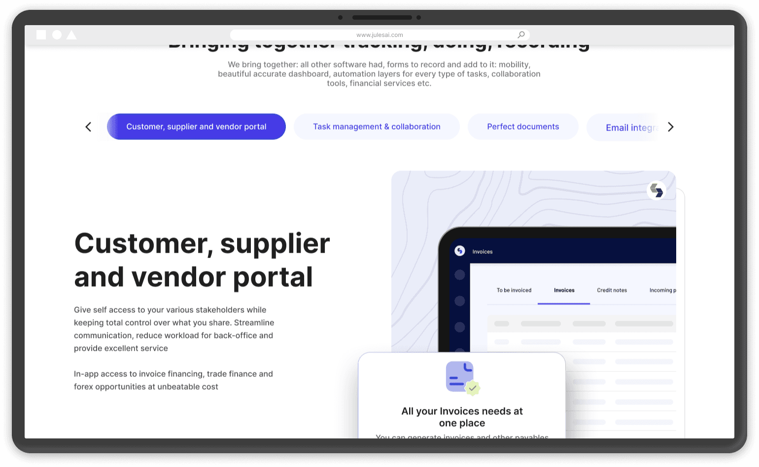

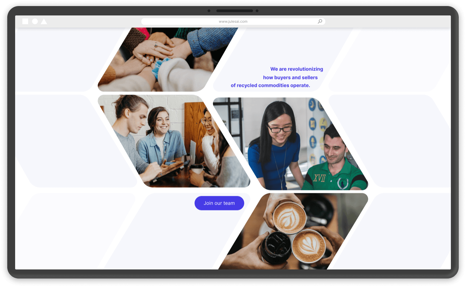
Project Name: Jules AI Landing Page Design
Role: UX/UI Designer
Team: Senior Designer, Product Manager (COO), myself, and a third-party development agency for build
Duration: October 2023 - November 2023
Tools: Figma, FigJam
Website: https://www.julesai.com/
The Problem
Jules AI's existing landing page wasn't doing its job. It wasn't clearly communicating what Jules AI actually does or why it matters to the people who'd be evaluating it, mainly potential clients in the trading and recycling industries. Here's the thing about a landing page for a niche B2B audience like that, it has to work fast. People aren't going to dig around to understand your value proposition, so if the page doesn't land it in the first few seconds, you've lost them.
My Role
I worked alongside a senior designer and the COO, who was acting as product manager on this project. I owned the UX/UI design work directly, from early research through to the final handoff, while the senior designer and COO shaped direction and messaging with me. Development was handled by a third-party agency, so a big part of making this work was building a spec tight enough that a team outside our own company could implement it accurately without us in the room every day.
Research
Before touching any screens, I looked at how Jules AI was actually being described internally versus how it came across externally, and where that gap was losing people. Internally, the team could explain the product's value in a sentence. Externally, that same value was buried under generic language that could have described almost any AI platform.
Alongside that, I looked at what trading and recycling industry buyers actually care about when evaluating a platform like this, credibility signals, plain language over jargon, and a fast, clear answer to "what does this actually do for me." That research shaped what needed to be above the fold versus further down the page, and it ruled out a lot of the generic SaaS landing page patterns that wouldn't have landed with this specific audience.
Structuring the Story
Using FigJam, I mapped out the narrative arc the page needed to carry, what problem Jules AI solves, why it's credible, and what a visitor should do next. Once that structure was agreed with the COO and senior designer, the actual screen design moved a lot faster, since we weren't re-litigating the story while also designing pixels.
Visual Direction
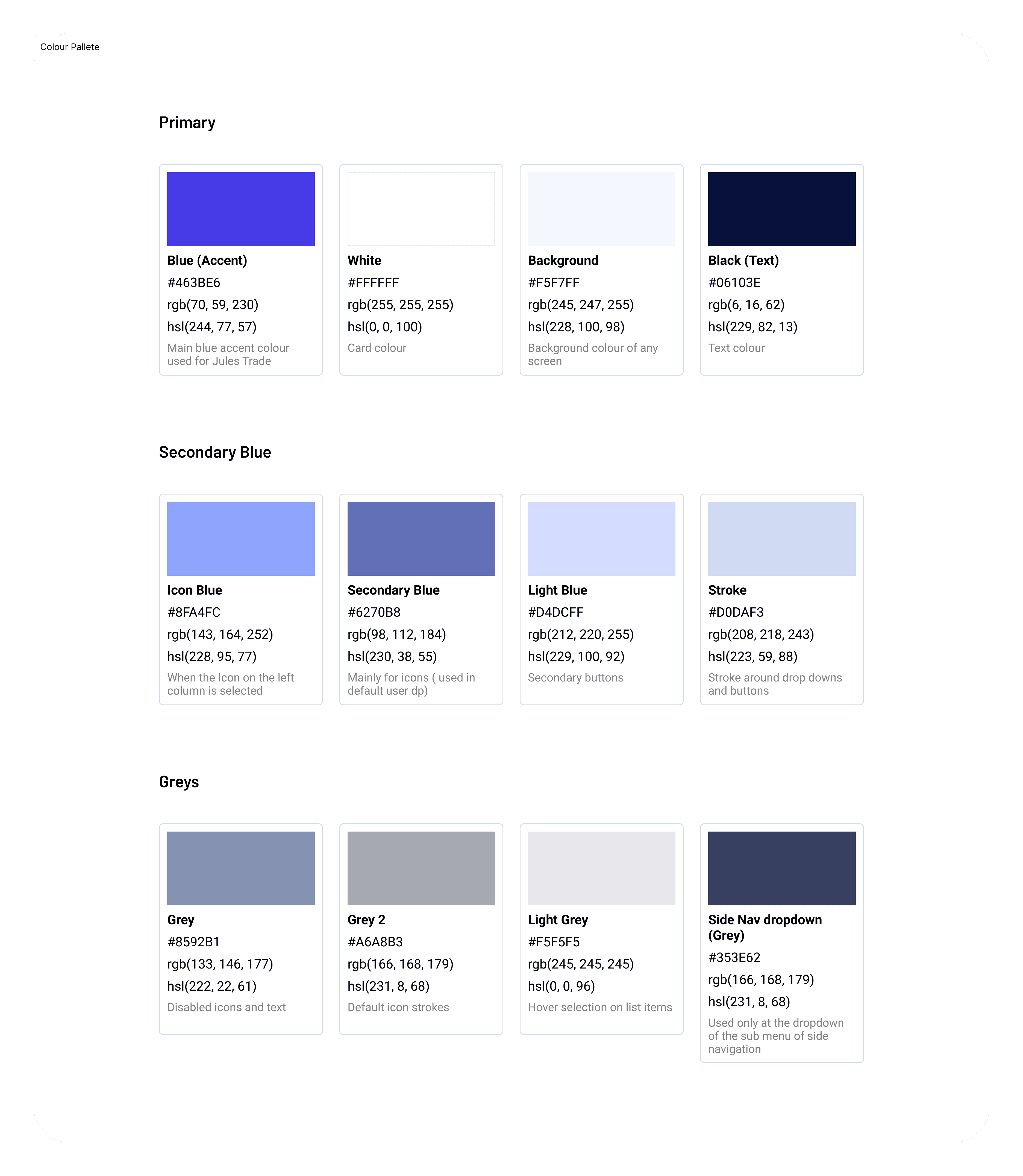
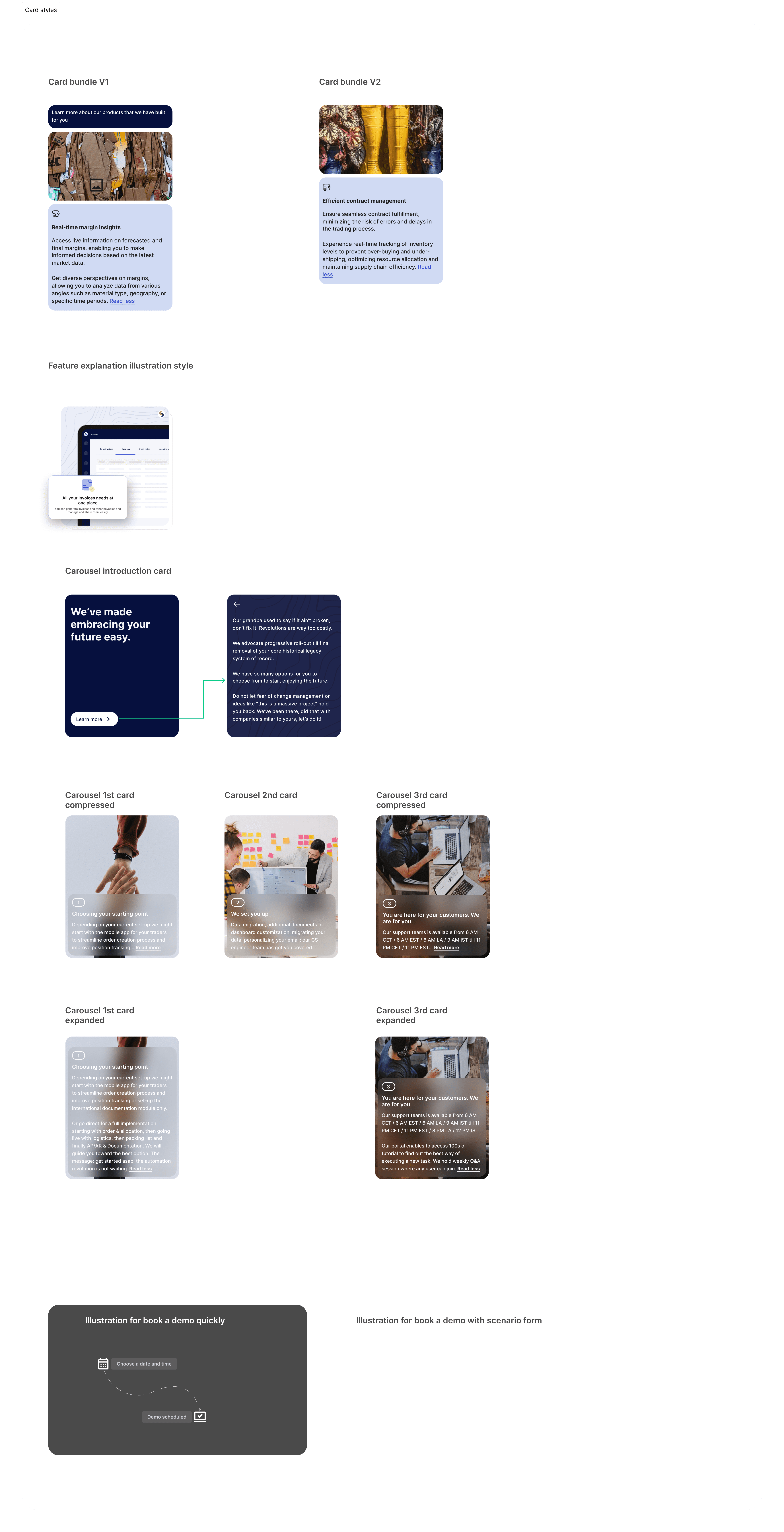
The visual direction was built to feel credible and modern without tipping into generic AI-startup aesthetics, industry buyers in trading and recycling needed to trust this platform, not just find it visually appealing. Card-based layouts were used throughout to break dense information into digestible, scannable pieces, which mattered given how much the research surfaced about buyers wanting fast, clear answers over long-form explanation.
Designing for Handoff to an External Team
Because a third party agency was building this, not an in-house dev team, I made sure the Figma file was clean and well documented, states, spacing, and responsive behavior spelled out clearly, so nothing got lost in translation with a team that didn't have the context we did.
Outcome
We shipped a responsive landing page, for both web and mobile, that gave Jules AI a much clearer, more visually cohesive way to introduce itself to the trading and recycling industry clients it was trying to reach.